
How I Built This ‘N’ That
My accountant, Robert Cratchit CPA, crunches his numbers in two dark rooms above a Panda Express, surrounded by beige filing cabinets that are older than Stonehenge, and a dusty display of museum-quality calculators and ink-jet printers that beep and belch with irritating regularity. The only window is permanently jammed shut in favor of an ancient A/C unit, recycling lukewarm air tinged with a vague hint of industrial-strength soy sauce.
The ambience in Bob’s office might inspire Edward Hopper to set up his easel and open his paintbox. A portrait of two shadowy figures furtively burning the midnight oil. Nighthawks At The Paper Shredding Machine, perhaps. I often think it’s the sort of place where Bernie Madoff did his internship.
Last July, after placing a to-go order two egg rolls and a thing of fried rice, I made my bi-annual ascent of the Bob’s back stairs to deliver some important news. ‘I’m starting my own color grading business,’ I told him. ‘It’s called Baldwin Colour with color spelled the English way. You’ll be seeing a lot more of me now that I need to file taxes quarterly and everything.’
His face darkened momentarily, as if this meant not just cooking my books but stewing them for several hours in a combination of congealed fraud sauce and dry-rubbed embezzlement. Fortunately, his mood lightened considerably as I explained my intention of earning a living by making web videos look nice. In fact, he may even have chuckled while shuffling through a stack of manila folders, searching for the appropriate forms.
‘A word to the wise guy,’ Bob said as I was leaving. ‘You should write a business plan, he suggested, doesn’t need to be ten pages, a couple of paragraphs will do, just a brief document outlining your services, a little market analysis, maybe some sales strategy and a vision for the future ….’
I froze in the doorway, completely nonplussed. Write a business plan? About what I do? I was hoping I could, you know, just fly by the seat of my pants. Really, all I need is enough color grading hours each month to pay the mortgage. I don’t need a business plan for that.
After all, it wasn’t like I’d be appearing on Shark Tank any time soon. Asking for fifty thousand dollars for a thirty-percent stake in my business. Demonstrating the value of my skills by applying a face refinement node to each member of the panel: ‘Observe how I can reduce the shine on Kevin O’Leary’s forehead while brightening Lori Greiner’s eyes at the same time.’
‘Sure, they both look better now,’ Mark Cuban responds. ‘But I really don’t care about that and neither does any other normal person who isn’t an art director. So I’m out.’
‘Thank you for your time.’
Anyway, should I require a loan at some point, I’ll just show the bank the seat of my pants. ‘Not too much wear, seams still intact, no fading, no stains. We’re very impressed with your fabric care,’ the bank will tell me. ‘Here’s fifteen grand. Go buy yourself some more data storage, little fella.’
Bob shook his head at these histrionics. ‘It’s not that difficult,’ he said. ‘Writing a buiness plan is standard practice. A statement of intent you can refer back to when going forward. And speaking of going forward, are you absolutely certain it’s smart for your business to spell color as colour?’
To be honest, I wasn’t certain of anything, except the fact that I wouldn’t be writing out a business plan. I’d rather start a Pinterest board about bowler hats and pinstripe suits. Write a business plan. Next thing you know, he’ll be telling me to form a mega corporation, brand the company as Big Color, then float myself on the New York Stock Exchange.
Accountants, eh? Who needs ‘em. If the IRS instituted a flat tax they’d all be doing Uber Eats instead of rolling their eyes and smirking at your optimistic list of home office deductions.
Nevertheless, at a loose end the following morning, I sat at my computer and typed out these terrible words “Business Plan: sign-up for Baldwin Colour account on Facebook and invite people to like my page.” Then I drank my first cup of coffee and deleted the entire sentence. It’s going to be seat of the pants strategy or bust.
Recently, I was listening to NPR’s How I Built This, a podcast about entrepreneurs who get rich by selling unnecessary innovations to gullible, impulse-purchasing consumers. The interviewee is usually some slick, A-type impresario who’s monetized a problem that didn’t exist before their own contagious self-delusion invented it … and all that problem’s lucrative side-effects.
This week, it’s a former Instagram software engineer who is now CEO of a pet care company that makes miniature Crocs for dogs and tiny Birkenstocks for cats. Next week, Robert Cratchit, a former accountant and ex-con who repurposed an old fast-food franchise storefront into America’s first cryptocurrency-based Savings and Loan Association.
At the end of How I Built This, the host asks his guests what percentage of their success do they attribute to hard work and how much to luck. Without fail, they modestly reply that it was fifty-percent sweat and fifty-percent good fortune. ‘If I can do it, anyone can do it. All you need need is perseverance and a dream.’
At Baldwin Colour, the ratio is forty-percent hard work, forty-percent luck, eighteen-percent keeping copies of my clients’ files so I’m the hero when they accidentally delete their versions and didn’t make a back-up, and two-percent a cinematographer who shall remain nameless who repeatedly forgets to white balance his camera. I believe those are solid and stable numbers. Don’t you agree Mr Wells-Fargo?
Honestly, the ‘thinking-out-of-the-box’ type businesses profiled on How I Built This seldom seem like profitable enterprises to me, yet the whizz-kid founders behind them always manage to raise millions in funding from venture capital firms. So what do I know? My stakeholders are Mastercard and Visa, who demand prompt repayment every month or else I’m staring down the double barrels of spine-chilling APR surcharges.
Still, despite the lack of any coherent business plan, flying by the seat of my pants is going reasonably well. I’ve actually been able to expand to three pairs now: medium gray for broadcast spots; tan chinos for web video; and black wool for attending industry events in the evening. I guess that’s what you can describe as ‘growth.’
The Other Side Of The Camera
Most people feel uncomfortable in the harsh glare of the spotlight. They prefer retreating into the shadows rather than striding to the front of the stage. I’ve certainly never been ready for my close-up. Nor my medium or long shot for that matter.
Like most bald and pale men with British teeth, I belong behind the scenes. About twenty miles behind the scenes. Faraway from the cameras and concealed in the back of the grip truck wearing a fedora and dark sunglasses. And possibly an invisibility cloak, just to make absolutely sure I can’t be seen. Yep, now I’m ready to face the world.
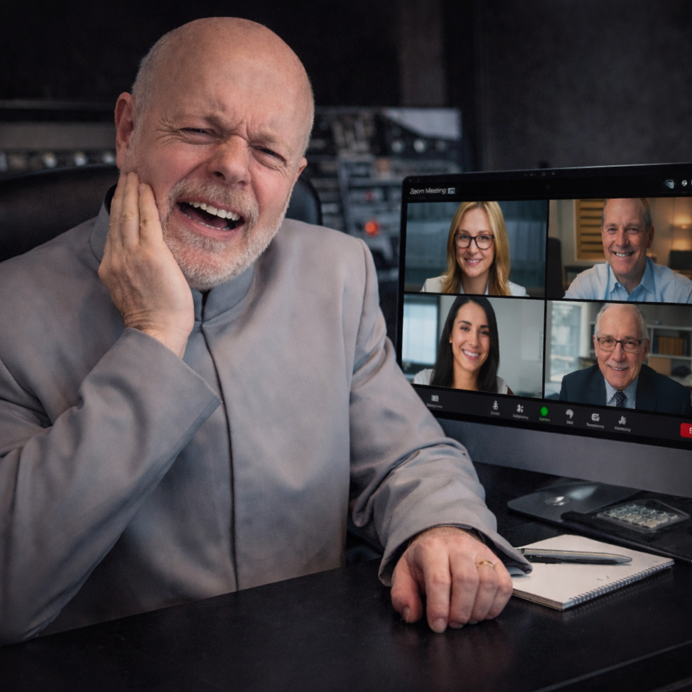
Consequently, having my ugly mug beamed around town on pre-pro Zoom calls or Microsoft Teams has been a decidedly mixed blessing for me. On the one hand, it offers invaluable client face time. On the other hand, it’s my face the clients are forced to look at.
I’ve tried keying myself over a very distracting background. But it doesn’t help. Uncharitable critics might suggest my on-screen presence exudes a veritable Dr Evil vibe. Except I’m merely asking for my day rate, not demanding a million dollars (although I guess that depends on how many revisions there are).
Whenever I receive a virtual meeting invite, my Self-Esteem seriously proposes investment in a Queer Eye For The Straight Guy type makeover. Fake tan, luxurious blonde toupee, dazzlingly white dental veneers. Imagine the bronzed and beached star of a toothpaste advertisement filmed in the Caribbean. That would be me. Everybody else on the Zoom would need to turn their monitor brightnesses down, just to accommodate my blindingly charismatic aura. Although I’d need to quadruple my meagre day rate to afford that much radical remaking and remodeling. So it’s not happening any time soon.
Honestly, after color grading for many years I’d still quit in frustration if required to add warmth and life to my own flesh tones. It’s an impossible job that no amount of FX Face Refinement, Beauty LUT, soft focus, eye-light, forehead shine removal, or saturation boost can fix.
And HD-quality laptop webcams conspire make me appear even more anemic than usual. I was much happier just listening to disembodied voices on old-fashioned, non-visual conference calls. And I didn’t have to pretend to pay attention to the Audio Guy’s nonsense, either. Great days indeed.
So to avoid Zoom personal appearances, I make a point of asking “Could this be an email?” Unfortunately people love sharing sample images and reference videos on their screens, so their reply is more often than not a resounding “No.”
Of course, the resulting video chat is never just me and my client. My client’s client is often invited also. And my client’s client’s friends and family. And anyone at the agency who’s at loose end that day. And so on. Suddenly there are about twenty participant faces staring back at me from the Zoom gallery. Many of them don’t know what color grading even means. And they’re all wondering who the pasty-faced dork mumbling about gamma curves is, and why the host doesn’t mute his microphone already.
Matters came to a head in mid-March. In addition to all my regular physiognomical insecurities, I endured an entire day of invasive oral surgery that restructured my entire mouth. With the perpetual cold and unseasonal snow flurries outside, it felt like being tortured and interrogated by a ruthless, drill-toting KGB dentist: “Who is your periodontal contact in Moscow? Rinse. Where is your dental insurance? Spit. That will be three thousand of your capitalist dollars. Rinse. I’ll see you again in about three months.” But the surgery went well. I told the dentist nothing except my name, rank, and number, and a sorry excuse for not flossing enough.
There was, however, there was a great deal of unpleasant and unsightly swelling around my lips and gums. As if I’d gone overboard with industrial-strength Botox injections. Or fallen victim to some vengeful Tooth Fairy’s terrible curse.
I was still the spitting image of Dr Evil. But a Dr Evil sucking two lemons, extra bitter, one wedged in each cheek. Not a good look, not even for someone who didn’t look good to begin with.
Nevertheless, I could easily conceal my hideous disfigurement behind an old Covid mask if absolutely had to go outside. Or a motorcycle helmet with a very dark visor. Or a black wool bank-robber’s balaclava. Perhaps an ornate, long-nosed Venetian carnival mask, if inspired by a whimsical mood. Or just a proverbial paper bag over my head on the dull days. Covering up my lower jaw wasn’t the problem.
No, far more concerning than that was the spontaneous speech impediment it all caused. Thanks to residual numbing effects from the KGB dentist’s novocain needle, I was “thawking thike thith” all the time. And that was a huge problem.
You see, I was inconveniently booked on an important Zoom call with wealthy new clients. They wanted to hear my thoughts about color palettes and workflow. But all I could think about right then was prescription painkillers and antibiotics. And whether hot packs or ice packs were better for reducing swelling.
Talk about scheduling conflicts (something I was obviously unable to do, at least in any coherent fashion). “Thwow me a fwicken’ bone here!” as Dr Evil might say. If only I employed an efficient secretary to organize my daily calendar. Alas, I can’t afford staff with my current massive dental bills. In fact, I can barely afford Google Calendar now. And that’s free.
I’d need a big bowl of Chicken Soup For The Soul to survive this latest, double-whammy Zoom ordeal, which was lucky since chicken broth and yogurt were all I was allowed to eat for the next two weeks.
When life gives you lemons, make lemonade, as the saying goes. Or, in my particular case: when life gives you lemons, make lemon-flavored antibacterial mouthwash.
One such upbeat strategy is to ‘just have fun with it.’ Be the wild and crazy guy on the call. Crack a series of side-splitting, self-deprecating jokes about my mangled mouth and inability to talk properly. But that entails delivering a punchline without spitting all over my keyboard and mouse. So not a viable option in the circumstances. At least not in the initial stages of the pre-pro, anyway.
I could blame everything on the infamous inefficiencies of whatever meetings app the client uses. ‘I prefer to use the latest open source software you guys don’t have yet.’ But I don’t want the clients to think I’m a snobby whiner and troublemaker who’s difficult to work with. So scrap the finger-pointing plan.
When all is said and done, I guess I should just own it. Explain that I’m a long-suffering casualty of primitive British dentistry paying for the sins of his periodontal past. Maybe I’d be awarded the job as a philanthropic donation from the client to an obviously needy case. ‘Give it to the Phantom of the Opera guy. He looks like he could use some Red Cross humanitarian aid.’
But there was no time for such gambits and gimmicks. I just had to suck it up. Log-on, smear a little grease on my webcam lens to soften the focus, and roll with whatever sledgehammer punches came at me.
Ultimately, the clients did most if not all of the talking on the call. They were busy creatives, preoccupied with poring over style sheets and referencing last year’s video. They barely noticed me amongst all the streams of information. So could I achieve this look they wanted? I said I could. They told me they’d get back to me in a week or so.
Now that wasn’t so bad, was it? Short and sweet. In fact, surprisingly, it all seemed to go rather well. I didn’t even need to repeat everything I said six times with a bag over my head. Score. All that anxiety and self-doubt was for no reason. And my gums will be healed next time I virtually meet with them, so I will be able to speak with authority, confidence and clarity. Bring it on.
However, as you might expect, it’s been over a month now and there’s been nothing except a brief email about the schedule being pushed back until June. Or possibly July or August. Typical. I swear to God, trying to organize a work schedule these days is like pulling teeth.
Gig Economy Oligarch
Ah, the existential angst of contemplating an empty work schedule. Those blank spaces in the calendar beg the soul-searching question: Do I actually own and operate a viable color grading company, or am I just running a glorified side hustle with its own blog?
Well, I guess the answer kind of depends on the day.
On good days, I’m a successful entrepreneurcontemplating multi-million dollar offers from Shark Tank investors for a 2% stake in Baldwin Colour. Imagine a video industry Henry Ford who says “You can have any color you want as long as it’s rec.709.” In between client calls, I sip a lunchtime Negroni while surveying the city from the panoramic, floor-to-ceiling windows of my plush penthouse office that rotates on the top floor of my massive and ever-expanding brain.
On bad days, however, when the slump slaps me in the face, it can feel like I’m a mere color grading TaskRabbit who does Uber Post Production to make ends meet: “Baldwin is driving a DaVinci Resolve and will meet you at the color export page.” I would charge surge pricing, but apparently the budget for most projects these days is super tiny and forever shrinking. At least I’m not required to pick up belligerent drunks at midnight in the bad part of town — although I’ve worked some sessions where certain people who shall remain nameless have … Never mind.
Today, since I have time to update this blog, I clearly identify with the "lowly tech serf exploited by digital feudalism,” and not with the fake-tanned billionaire wintering in the Cayman Islands on his super-yacht, developing his own private space program while consulting with the White House via satellite phone. Alas, the only Musk we know around these parts is an ancient bottle of rancid aftershave in the back of my bathroom cabinet.
It's still the start of the year, I tell myself, and the start of the year is always slow. But is it really? And besides, it’s nearly March so who am I kidding? Nevertheless, it did snow last week. Perhaps I can write this slow period off as a Snow Day. The work will start rolling in again once all my many, many clients dig themselves out from underneath the frozen tundra
Or, God forbid, my clients are now sending all their projects to that inexplicably glamorous ‘new guy in town,’ the one who probably also offers to plow their driveways for free because he’s suddenly ubiquitous and everyone’s best friend. Soon he’ll be sponsoring the open bar and distributing branded baseball hats at some industry networking event everyone except me attends.
Yes, the procrastinating recluse Baldwin is just sitting at home writing a stupid blog about his reduced employment opportunities while lucrative deals are being struck elsewhere. That is, until the inexplicably glamorous new guy screws up big, because it turns out a color-blind zebra knows more about accurate skin tones than he does. And that always happens. Then my clients start trickling back as if the inexplicably glamorous new guy never came to town in the first place.
Which he didn’t, because he was always just another very ripe figment of my professional paranoia.
Such is the manic-depressive life cycle of the color grading professional who owns his own business, or freelance career, or day job, or side hustle, or whatever we are calling whatever I do for a living. John D. Rockefeller or Hobo Joe: who will I be next week?
AI vs Me
“Sure. I can help you with that. Here are some ways I can do your job faster and more efficiently, making your skillset completely obsolete. Would you like me to list them?”
Chat GPT, eh? It stalks the businesses of the land like that obsequious, overly confident, toxic new employee who’s planning to marry the boss’s daughter. It’s a pedantic know-it-all reorganizing your department, replacing your assistants, rerouting your workflow, reordering your files, and repurposing your job description. And don’t tell ChatGPT everyone’s going for after-work drinks, or you’ll find yourself at an all-night KaraokeGPT bar, singing Daft Punk songs and doing the robot dance.
Nevertheless, sooner or later you will need to become friends with whoever (or whatever) is marrying the boss’s daughter. Otherwise you’ll arrive at work one morning to find everyone is humming Get Lucky except you. And before you can say ‘lay offs,’ you’ll be singing street karaoke in the gutter. Buddy Can You Spare A Dime? But nobody can because Artificial Intelligence has also stolen their jobs.
Offices everywhere will soon be staffed entirely by technology called Gemini, Claude, CoPilot, or Perplexity. Each working day will be like Planet Of The Apes, but the orangutans are Tech Bros and Charlton Heston will discover a massive pink highlighter pen half-buried in a beach of shredded W2 employee forms. The face on the cutting room floor, meanwhile, will be yours.
So I’ve been brainstorming strategies to AI-proof my career. Unfortunately, I’ve come up with absolutely nothing whatsoever.
Of course, I could stoop to asking ChatGPT for AI-proofing career ideas, but don’t want to give it the satisfaction of providing me a link to LinkedIn Premium, or websites promoting online Plumbing and Locksmithing certification, or answering endless consumer surveys for five cents per hour.
Not that I consider myself above those professions, but I’m too old to be summoned at 3AM to unblock some drunk student’s grimy toilet. Besides, I’ve spent most of my working life perfecting the fine art of making the shadows in wide shots a little bit bluer. Surely mine is a profound and ancient wisdom worth honoring and preserving, if only by offering to pay me a respectable hourly-rate or reasonable fixed bid for color grading your thirty-second spot.
But let’s face it, “Make the color of this scene match the color of the previous scene” is a simple and straightforward AI prompt that any old fool can give their Chat-Bot. So why would clients hire me instead of using Artificial Intelligence to bring polish and pizzazz to their projects?
It’s a very good question. I’m glad you asked. And to use Chat GPT’s own words against it, “I can help you with that …”
Personally, think of the Quicktime files Baldwin Colour exports as wide-gamut masterpieces; unique examples of my exquisite artisanal craftsmanship displayed on a variety of screens to inspire awe and wonder in the viewer. AI’s schlock work, by comparison, is just mass-produced garbage slapped together by slave laborers in a dismal third-world factory. The priceless, museum-quality artifacts originating in my studio will last forever. But the cheap junk from AI’s digital sweatshop will fall apart within two weeks.
To put it another way, imagine Baldwin Colour as a much-loved vendor at the local Farmer’s Market, proudly offering you a dazzling array of organic fruits and hand-picked vegetables. Artificial Intelligence, on the other hand, is just some mega-chain convenience store with self-checkout trying to sell you a can of ultra-processed turnip soup. And they don’t even stock the brand of turnip soup you want.
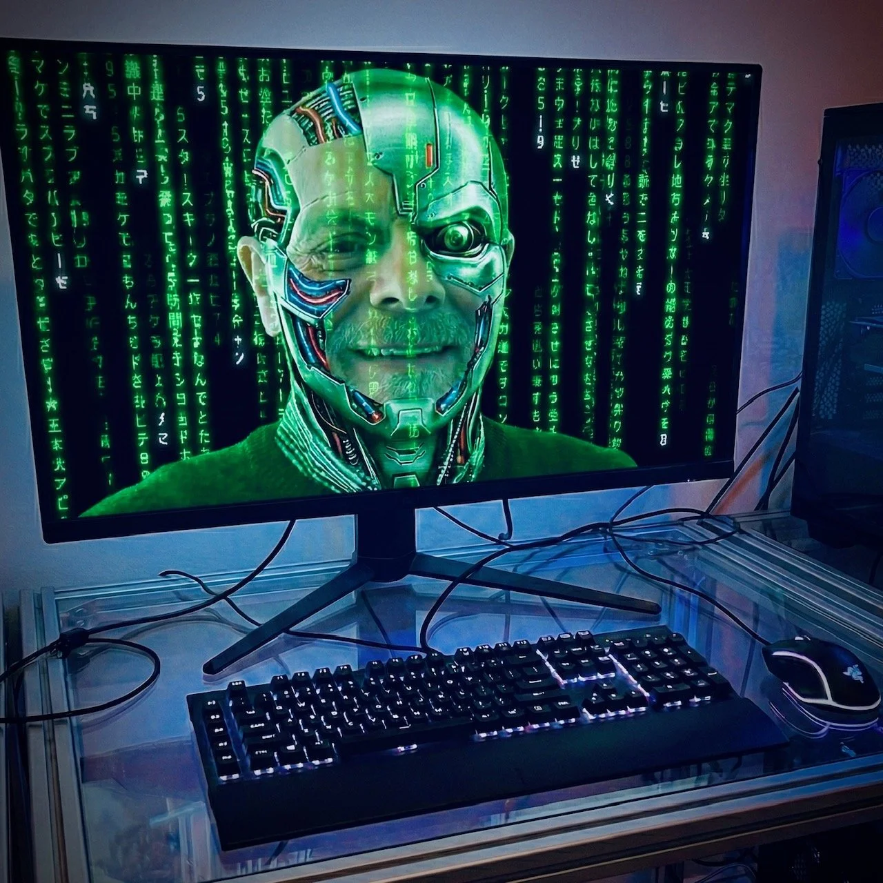
You get the picture, and it doesn’t have six fingers and only half a leg like most AI rendered images. Honestly, just look at the insipid cyborg cliche it created to accompany this very blog post, despite the very smart and ultra precise prompts. I provided. Next time I’ll just draw something myself with paper and pencil. It will be quicker and easier.
So please keep sending your projects to real humans, and not to some jumped-up HAL wannabe that sells all your personal info to Google or Apple or wherever. Besides, my hourly rate these days is almost as cheap as an AI pro subscription, so you’re not saving any money either.
I guess you could sign up for a free AI trial and then cancel, but who ever remembers to cancel those things? Not me. I’m still paying $29.99 a month for LinkedIn Premium and I haven’t visited the site in months. Thanks but no thanks to ChatGPT for that worthless employment search suggestion.

Sales Cringe
The first item on this morning’s agenda at Baldwin Colour is to make a few sales calls. I need to drum up some new business, maybe even reconnect with some old business, and an old-fashioned phone call is still one of the best ways to get the ball rolling.
Working for myself these days means I’m juggling four full-time jobs: Salesperson, CFO, Barista, and whatever it is that I actually do for a living. It’s often difficult to remember what my real job is because wearing those Salesperson and CFO hats eats up so much of my time, especially when I’m negotiating the size of my own expense account with myself. And the line at my Barista counter also gets really busy if I’m color grading a Kung-Fu feature film from the 1970s. It takes a lot of coffee beans to get through all those mismatched shots from different sources.
Speaking of coffee, maybe I should drink a cup before making my sales calls. After all, a little extra caffeine boost will surely be helpful when I‘m trying to close the deal. In fact, let’s make it three cappuccinos and an almond biscotto. That should do the trick. I know it does seem like I’m procrastinating here, but ….
Well, let’s be honest, I’m terrible at cold calling and I hate making them. My calls aren’t just merely cold, they are positively Arctic. Whatever cold calling skills I possess are buried deep beneath twelve feet of permafrost. I immediately turn into a frozen fool when anyone answers. For example:
‘Hi, I was wondering if you guys needed any help color grading your latest video?’
‘No, not really.’
‘Okay. Thank you for your time.’
It could be dialogue from Arthur Miller’s famous play Death of A Salesman, but it’s actually the complete script of my own self-penned drama: Cremation Of The Salesman And The Scattering Of His Ashes To The Four Corners Of The Earth, performed by the Tongue-Tied Amateur Theater Company with sets by Zoom and Microsoft Teams. The matinees are particularly bad because the actor hasn’t had lunch yet.
I also tried putting on a Dog And Pony Show at a client’s office, once, but that quickly turned into a Three-Ring Circus when my demo reel inexplicably refused to play and I was left holding the keys to the clown car. That client might hire me to provide the entertainment at his children’s party but I wasn’t getting anywhere near his broadcast spots.
So to attract new business I’ve always needed to rely on the oldest and greatest salesperson of all: Word Of Mouth.
Word Of Mouth is a sales pitch dressed as friendly advice and it goes something like this: ‘If you want to add some much needed pizzazz to your video and really make it stand out, there’s this color guy called Baldwin. He’s been around for a while and he’s pretty good. I’ve used him a number of times and he always does great work. You should give him a call. He’s not expensive so you can definitely fit him into your budget without breaking the bank.’
I couldn’t put it better myself.
Unfortunately, as the years go by, many of the people I know are getting out of the business, meaning all that good word-of-mouth is increasingly falling on deaf ears. Former creative directors are now full-time into Real Estate, and ex-cinematographers are hawking their homemade pies at Farmers Markets in the city. Some of my contacts are so ancient they don’t actually need to work anymore anyway. I’ve recently had a number of conversations go like this:
‘Hi, I was wondering if you needed any help color-grading your latest video?
‘No. I don’t have a latest video because I’m retired.’
‘Well, okay then, does your Assisted Living Facility needs help color-grading their latest video?’
‘Yeah, maybe. I can put you in touch with Dennis who runs our YouTube channel.’
Personally, I’d mark that down as a successful sales call. The result may only be working on a short clip about old folks playing backgammon in Sunset Lounge, and I doubt they can pay full-rate on a fixed income, but from such small acorns do mighty oaks grow. Who knows, I could soon be jazzing up niche video for Retirement Homes across New England and beyond. Work is work, as they say, and it all adds up.
Meanwhile, second item on this morning’s agenda at Baldwin Colour is to cross-post this Suite Talk entry on my LinkedIn and Facebook pages. Hey, it’s almost like I’m creating a whole sales campaign right from the comfort of my home office. Maybe there’s hope for me yet.

From Hardbacks to Hard Drives
Once upon time, I had book cases crammed with paperback novels, Bible-sized tomes instructing me how to use computer hardware and software, and biographies of celebrities and historical figures it turned out I hated after reading about them. Now all that stuff is on my Kindle and the old bookcase shelves are full of removable drives containing a copy of media files from last year’s projects.
I wonder when IKEA will make a bookcase especially designed for stockpiling hard drives, featuring easily accessible compartments for their power cables and USBs and all the other associated data storage and transfer nonsense. Perhaps they already do? Although I think my wife my prefer to get the Indonesian theme version from World Market. It’s fine with me as long as as the color doesn’t clash with the protective orange exterior of a Lacie 4TB drive.
I’ve often thought about investing in some massive network RAID instead of accumulating hard drives. But since I work at home I don’t want the corner of my dining room to look like the NASA nerve center, all racks of sleek looking black boxes and flashing lights. Although the flat top of a large enough RAID might be a good place to keep extra plates and cutlery and so on. Maybe even a few favorite condiments. But that wouldn’t be very professional. “Sorry, I wasn’t able to load your Quicktime files because my high-speed data connection is covered in ketchup.”
So an old-fashioned bookcase filled with removable hard drives it will be, color-coded by client. Maybe I could even conceal the hard drives inside the dust jackets of appropriate literary works. So there are one or two difficult clients who’ll find themselves wrapped in Charles Dickens. That guy who always gives me baffling creative notes will be a Sherlock Holmes. And, of course, I’ll cover your project hard drive with a revered and much-loved Penguin Classic: Jane Austen or Mark Twain. My own personal archives will be slipped into something by George Orwell, but that’s another story.
My Beer O’Clock Playlist
At the risk of exposing my self to music snob ridicule, here is my beer o’clock, celebratory, ‘we’re done for today’ Spotify playlist.
It’s mostly up-tempo music in a variety of styles because the day’s work is done and we’re exporting all the color-graded files.
Obviously, I have a more down-tempo playlist if the shots come back for revisions, but I’ll save that for another post.
Going Down The Wrong Path
We’ve all been there. Spending what seems like an eternity grading a problem scene. The minutes drip by like Chinese Water Torture but still nobody is prepared to sign off on that look.
So you add more warmth. You step back on the greens. You darken the left side of the screen and brighten the right side. You boost the highlights, obviously, and you feather the shadows (nobody knows quite what this means but everyone agrees it needs to be done).
Since it’s still not working, you give the talent a little extra eye light and you reduce the slight glare on his nostrils. Still nope. So out of sheer desperation you slap on a huge vignette and then you … you get the picture.
But that picture still doesn’t look right. For some inexplicable reason the damned scene doesn’t match any of the others you’ve already graded.
The clients love the previous shots. The previous shots look like the Garden of Eden in cherry blossom season. But the shot we’re currently working on might as well be Hell’s parking lot in mid-December. All you did was adjust a few parameters and now it’s total chaos. How did the session end up here?
Of course, even the slightest of changes can have an enormous knock-on effect. “Feathering the shadows,” for instance, washes everything else out. So you try to compensate for that by finessing the luminance and increasing the overall saturation. But now it’s starting to look a little cartoonish. So you compensate for that with more contrast and decreasing the saturation in just the mid-tones. Hmm. That didn’t work all. Now it just looks weird.
Clearly, you’ve gone down the wrong path and got yourself lost in the color grading wilderness. You can almost hear the ominous twang of a Hillbilly banjo on the audio track timeline. But it’s being drowned out by the executive producer’s sighs and groans. Alas, this time consuming detour was definitely not in the budget. Are we going to have to pitch a tent and come back to this tomorrow?
The best thing to do in this situation is to return to base camp ASAP. Turn off all the color nodes and FX until all that remains is your primary set-up. This is the color grading equivalent of realizing you were following the 20 Best Hikes In Appalachia maps when you should have been consulting Street Guide to NYC.
At this point, when the color and contrast are back at their original settings, at least one of the clients will say. “That looks good. What did you do?”
“I’m trying something else,” you reply, hoping they don’t notice you’ve simply erased all the labors of the past half-hour in favor of what came out of the camera.
“I like it,” everyone says, and you are the hero who saved not only the day but also the producer’s bottom line. Even more so when you add just the tiniest amount of warmth and practically invisible vignette, while keeping a keen eye on your grading GPS. “Yeah,” everyone agrees. “Let’s move on.”
The Comfort Zone
Back when color grading was called color correction, back when Julius Caesar was a director, Mark Anthony his DP, and Cleopatra the agency creative, our media was 35mm film negative rather than hi-res files.
Forget about data storage issues and corrupt Quicktimes, the problem with color correcting 35mm film negative was plain old dust. Microscopic filaments of airborne effluvia that somehow managed to fall onto the frame you were color correcting.
So it was super important to get the color right ASAP, because running the film back and forth too many times kicked up too much dust. And when magnified by the telecine, dust manifested itself as ugly white spots on the image. Not good. Not good at all. Who cares if the talent’s skin seems too green if there’s a huge white blotch on her forehead?
Dust meant you’d need to clean the film with Trichloroethylene, which was as nasty as it sounds. And cleaning the film raised the possibility of scratching the film. Who cares if the product needs to be brighter if there’s a huge gash across the product’s brand name?
So, as I said, super important to get the color right ASAP before the dust Devils came knocking with their good friends Scratches, Scrapes and Sprocket Damage.
Back then, color grading was a lot more complicated than loading the footage, creating a timeline, and adjusting your primaries and secondaries. There was a lot that could go wrong. Very wrong. Consequently, it was vital to create a comfort zone for your clients.
This meant mood lighting in the suite, overstuffed armchairs, artisanal soda, freshly brewed coffee and obscure flavors of herbal tea, the obligatory platter of sushi, Smartfood popcorn and peanuts roasted in exotic spices most people have never heard of, candy bar variety pack, and finally the promise of a chocolate Martini when the session was done. A very comfortable working environment provided things were going well. But things could sometimes go too well.
For instance, I had a client fall asleep in the suite one mid-summer afternoon. ‘What do you think of this?’ I asked him, after applying a particularly astute hint of blue to the mid-tones of the first shot. His only reply was a comatose grunt followed by a series of volcanic snores. Way too much sushi at lunch, obviously.
Should I wake him up? If so, how?
‘What do you think of this?’ I asked again, this time in a much louder voice.
A brief snatch of incoherent dialogue from a salmon sashimi inspired dream is the response.
‘WHAT ABOUT THIS?’
Still nothing. Oh well, as long as he doesn’t fart, I told myself, I’ll just keep running through these scenes until we’re done.
Of course, it was necessary to review my color decisions when he woke up an hour later. At which point, he informed me they had previously established a look that I was supposed to emulate. ‘I have some reference frames here,’ he said, yawning. ‘Did I doze off there for a moment?’
‘Yeah, just for a second or two.’
Nowadays, when a client’s comfort zone is their remote home office, color approval arrives via email or text rather than in person, and depending on the number of opinions involved, can take up to a day or even a week instead of happening instantaneously. So who can guess what they get up to while I’m making color decisions? If the spot is in the apparently interminable process of being reviewed by legal, then the clients could be vacationing in the Bahamas for a month as far as I know. But as long as they’re good. I’m good too.
Just get me those reference frames before we begin. Thanks.
Home Is Where The Colour Suite Is
Color Grading At Home
Slip out of bed, drown your face in a carafe of coffee, wish you could reduce the color saturation on that bowl of Fruit Loops, fire up your color grading software and you’re ready to make pretty pictures from the comfort of your own home office.
These days, it seems like many people regard the working day as a clothing optional activity. I’m sure they can focus in their PJs and sweatpants but I absolutely still feel the need to dress-up for work, even in the privacy of my residential color suite here in Somerville.
This is serious business, after all. So it’s long pants, collared shirt and polished shoes for me. I might even add a stylish blazer for a Zoom call with a client, although I’ll replace that button-up shirt with a crewneck tee when I’m trying to be fashion-forward. I usually fail but I hope people appreciate the effort.
No, I wasn’t the kid at school who never took his coat off in class. I just empathized with his sartorial neurosis.
Back in the day, when people had to work face to face in the same room, everyone tried to look the part. Not quite black turtleneck and matching beret, but they definitely attempted to radiate some sort of creative aura, which might be Goodwill bohemia or designer couture or a mix of the two and everything in between. I remember one guy even wore dark wraparound sunglasses for our entire color session. But he was very creative. Nevertheless, the producer and I had to stay late adjusting the brightness levels back down after he left.
Whatever, you can brainstorm in your favorite Cosplay costume and do revisions with giant rabbit ears on your head provided you deliver a top notch job and meet all the deadlines. But the added bonus nowadays is: nobody needs to commute for an hour in Boston traffic to a “Post Production Facility” to check those boxes.
That’s mostly because there really is no defined “nine-to-five” anymore. I receive client emails and texts first thing in the morning and last thing at night. Everybody is on their own flexible schedule and it always seems to be the proverbial eleventh hour, even if the eleventh hour often extends into the twentieth and thirtieth hours.
A corporate video I’m currently color grading is now at the four-thousand-and fifty-seventh hour. My client’s client client (whom I’ve never met or spoken to) keeps changing his mind about everything. We color grade about one scene every two or three months. There had been a ‘drop-dead’ date sometime last year, so we must be into the second or third reincarnation by now. Perhaps some Past-Life Regression Therapy is in order? But those decisions are beyond my pay-grade.
Although I sometimes miss the immediacy of on-the-spot client feedback, an issue easily rectified with a quick mp4 render for color approval, I can think of few downsides to color grading from home. My dog will bark and yap at the screen if I’m adding too much contrast to a scene, but that’s easily rectified also: I give her a Milkbone treat and keep the contrast. Then there’s the inescapable lure of my espresso machine, which means also partaking of an imported biscotto that costs about the same as I charge for an hour of my color-grading time. But I just call that an well-earned if somewhat expensive snack break.
In fact, I guess the only real pain is the time it takes sending any file bigger than a mp4 back and forth across the Internet. For that chore, I prefer WeTransfer but also regularly use Google Drive, Filemail, Frame io, Dropbox, and even an ancient ftp site that a certain client still swears by. Occasionally, someone will show up at my house with one of those removable SSD things. Then I have to search through the bucket under my desk to find the correct cable.
But for all the time lag, downloading raw 4K video from a secure website has its consolations. While all that data is being transferred from modem to modem, I can figure out what outfit I’m going to wear for that day’s color grading. Since we’re miles apart and only communicating via email and file upload, you may never know what that outfit is. But rest assured, I’ve inevitably chosen black-tie formal attire if I’m working on your spot. After all, working on your project is an important, swanky, high-class affair.
Even if it just me at home with the dog, a fancy cup of coffee, and a high-speed internet connection.
The Famous DP
My clients were hiring a big name DP for a while. He was such a big name that he didn’t even need a surname. Just his first name was enough for instant recognition. ‘We’re shooting with Raoul’ the clients whispered reverently, as if Raoul was kindly allowing them along for the ride.
I immediately knew who they meant: Bicoastal Raoul, based in New York and LA, although he actually seemed to spend most of his time in Boston.
Before hiring Raoul, my clients had always employed local DPs. ‘Those guys are great,’ my clients told me. ‘But Raoul brings something extra to the table.’That something extra was an extra-sized ego as far as I was concerned. But I said nothing. After all, I was concerned that if Raoul got his way I wouldn’t be sat around the table myself for very much longer.
‘Raoul prefers to work with a color grader he knows in Manhattan.’ I was warned. And that turned out to be the case. At least for a while.
Apparently, the NY look of my client’s next set of spots was not exactly what was wanted. Where the local DPs and I had kept everything on-brand and copacetic, Raoul and his pal went rogue and inappropriate. K-pop video style might be fine for breakfast cereals and soda, but not for conservative financial institutions and banks.
So they brought all the footage back to Boston for me to re-color. In other words, make it look as normal as possible.
Don’t get me wrong, I like to play around and experiment as much as the next guy. I even think some big name DPs are pretty cool. But I know what the limits are for particular types of projects, and when I need to argue against some maverick’s cutting-edge caprice, I’m more than prepared to have a quiet word with them while we take a well-earned creative break.
Because after thirty years of working with clients and their clients, big name DPs, top shelf directors, and those mysterious people whom nobody knows exactly who they are or even why they’re at the color session, I’m not only an expert color grader, I’m also a first class diplomat, skilled psychologist, and a compassionate empath. You have to be in this game.
Raoul, meanwhile, has completely dropped off the radar. They come and they go, these big names from New York and LA. But we Boston stalwarts remain, plying our good, honest, and reliable trade.

Remote Viewing
Color is so subjective: not only our individual perceptions of specific hues and tones, but also how we describe those specific hues and tones to others, especially to others sitting in a color grading session.
For instance, this creative’s idea of ‘warm’ might be a slight yellowish-red tint., whereas her colleague thinks of ‘warm’ as a deep golden wash. Then there’s my concept of ‘warm,’ which is a LUT I made called Sun-kissed. What does Sun-kissed look like? Well, I guess it’s somewhere in-between a slight yellowish-red tint and a deep golden wash. At least it is for the purposes of this color session with these guys. After all, we’ve got a bunch more scenes to do and it’s already nearly lunch time. We don’t need to get hung up on differing notions of ‘warm.’
Fortunately, we all love Sun-kissed once we reduce the overall saturation just a squidge. We can even agree that the scene is now nice and ‘warm’ without looking too burned and frazzled. However, there’s one more thing. Sun-kissed looks great on this studio monitor but what will it look like projected on a big screen in the basement of Marriott function room? Will it look the same streaming on my wife’s laptop? How about when it’s uploaded to social media and seen on some kid’s mobile device?
‘What does it actually look like?’ is the question I’ve been asked more than any other in this job.
Sitting in a sports bar watching a big deal spot you color graded appearing on five different TVs is a spine-chilling experience. You’ll want to bury your head in the peanuts because you’ll be seeing five very different looking images on those five different TVs. One image is way too dark, another image is far too bright, that image is much too green and the image over there is washed out. Meanwhile, the image in the bathroom doesn’t even bear thinking about, so you can’t run and hide there. None of the TVs looks correct yet they are all receiving the same signal.
So what does it actually look like?
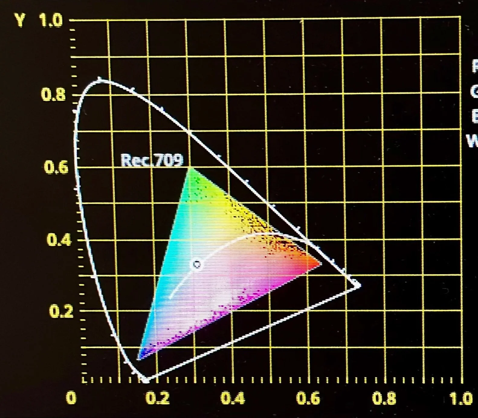
This is where color grading gets really existential, because all I can do is point at the vectorscope and mumble that ‘it looks like that.’ The map is definitely the territory here. But that map of undulating lines strung across a numbered graticule provides very little consolation for clients who can’t read the map, which is probably most clients in my experience. Consequently, they need to trust blindly that I can follow the map. That I’m capable of taking the image where it needs to go. And without aging myself too much, rest assured that I’ve been reading scopes for thirty years (luckily it’s a new story every time), so I know a thing or two about Rec.709 and P3 DCI video represented as a graph. I’m even somewhat certain that I understand HDR Rec.2100. Just don’t get me started on exactly how bright 4000 nits is.
FYI - my monitor is Calman verified and color calibrated … but I’d still trust my scopes the most if they were arguing with the monitor about ‘warm.’ They’ve never done me wrong yet and they won’t lead you astray either.
Adding Oomph
The Oldest Trick In The Book
When your color session reaches an impasse about the way a particular scene looks, adding ‘oomph’ to the image is the oldest trick in the color grader’s book. It kickstarts everyone’s creative juices flowing again.
Actually, making everything warmer is probably the absolute oldest trick, but adding oomph definitely comes a close second.
Although, on reflection, maybe adding oomph is only the third oldest, since the sleight-of-eye maneuver of pretending to brighten the picture up a tad when in reality you’ve done nothing at all is truly the second oldest trick.
Whatever, you get the idea: adding oomph is a venerable trick even it does only get the bronze medal for color suite skullduggery.
So what exactly is adding oomph? To be honest, I’m not quite sure how to explain it myself. But I do know what it is when I see it.
Oomph usually needs to added when the picture looks fine, it looks okay … but nobody can quite put their finger on it … but something is missing.
Yeah, the sky is overcast, the talent is kinda pasty, the product is brown, and why did they decide to shoot in a disused parking lot? It’s lacking a bit of edge. It could use some je ne sais quoi. A little lipstick and eyeliner. In other words, we should definitely add some oomph.
Now, you might think there is no “add oomph” magic button. But it just so happens that there is. Resolve and other color grading systems allow you to create and save special LUTS. They’re like instant ‘looks’ that you can turn on and off with a click of your mouse. Dark and moody; high contrast to make the shot grittier; blue in the blacks to give a cinematic quality; what I call “Tobacco Filter,” which is basically a slight sepia tint with a little desaturation; and so on.
Your client may not go for such drastic changes, but their comments combined with your own thoughts will point you in the right direction. And in this case, higher contrast definitely helps that overcast parking lot scene. Then we can window around the talent’s face to give him a healthy glow. Adding that extra oomph helps so much. I think we can move on to the next shot now.
Okay. So the next scene is plain oatmeal being poured into a gray bowl filmed against a white wall. I wonder what can we do with this? We’ll start with the vignette LUT and go from there I guess. It could use some more oomph too, don’t you think?
Split The Difference
When The Clients Can’t Agree
Clients usually have a good idea about the look they want for their project. It’s discussed and agreed upon in pre-pro with their creative team, the director, the DP, the client’s client, and sometimes even me. It’s amazing how painlessly the workflow flows when everyone is on the same page before we start grading. But there are unfortunate occasions when two pages get stuck together and it’s tough to know which page has final approval.
For example, a film director shuffled into my color suite, followed by an agency creative about five minutes later. They nodded at me but merely grunted at each other. They each made sure to position themselves at opposite ends of the client table like hard-bitten lawyers preparing to face off in a complex case of competing aesthetics: Warm and Fuzzy versus Bleach Bypass. The honorable but currently apprehensive Stephen Baldwin presiding. Please be seated.
The producer had already warned me that it was a difficult shoot and a contentious and lengthy edit. S my color session obviously wouldn’t be easy either. I’d need to wear at least two hats: Color Grader and Marriage Guidance Counselor. I should definitely call her, the producer said, if the session was going way over budget. I should probably put her number on speed dial, she added, just in case.
The air in the room was thick with differing opinions before we’d started grading the first scene. We were dealing with a thirty-second spot for dinosaur themed children’s breakfast cereal. Fast cuts and extreme close-ups of grinning kids munching on multi-colored flakes floating in frothy milk.
Let’s crush all the shadows, push the highlights into clip, and over saturate all the colors, the film director said. Let’s really make this thing sing.
No, let’s keep it real, the agency creative countered. There’s a lot of color and contrast going on already. It’s supposed to be breakfast for kids, not every drug addict’s favorite morning fix.
How about we split the difference? I offered, and see where we land. I guess you could call it compromise but I prefer the term “creative arbitration.” So I made three quick different color set-ups for the guys to consider: Straight Out Of The Can, Pushed Just A Tad, and Really Singing.
It’s amazing how the simple act of providing a few options to choose from can bring the temperature down when clients disagree. Suffice it to say, we all liked Pushed Just A Tad best, although we eventually reduced the overall contrast by a tiny squidge. I didn’t even need to call the producer and everyone left the best of friends. Cocktail time!

Snow Blind
A cautionary tale of color balance:
It was the best of footage and the worst of footage. It was ski footage.
Bright white snow and fluorescent jackets can be terrific graphic elements, but if you push them too hard the snow can bleach out and the vivid colors bleed off the scale. So it’s a baptism of fire if ski footage happens to be one of your first grading jobs. And I got my callow buttocks burned.
Ten thousand feet of 16mm negative film at 24fps. Roughly five hours worth of crisp white powder providing the backdrop for action figures wearing all the colors of the rainbow and then some. All shot on a sunny winter day with blue skies and everything consistently exposed. It looked great straight out of the can. It seemed that I’d barely need to nudge the RGB controls on my daVinci. Downhill all the way at top speed for the skiers and me. Here we go.
At least that’s what I thought.
Everyone’s perception of color drifts over time, especially when they’re sitting in a dark room, staring at a studio monitor for hour after hour. Before you’re aware of it, what was aqua now appears to be teal. Green begins to seep into the blacks. The medium grays are magenta. The highlights now have a hint of cyan.
Of course, this may be what’s required if the client gives you artistic license to create a look. But not if your brief is simply to reproduce what was envisioned on set and what the DP shot.
Such a neutral color balance is where you should start anyway, even if the brief is actually something avant-garde. Consequently, a grader needs foolproof tools to ensure he certain that neutral is exactly what he’s looking at before he begins going off-piste with the color knobs
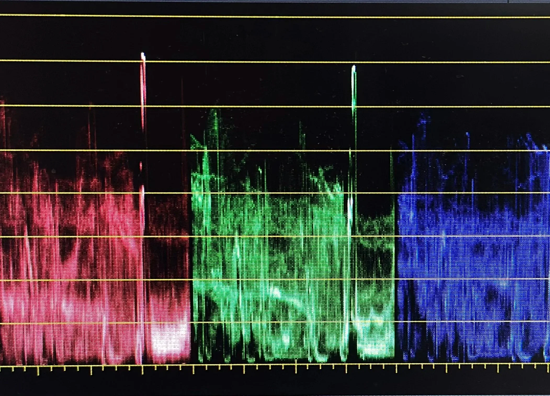
This is why the wise old engineers of the past gave us Vectorscopes and Waveforms. They’re incredibly useful tools if you know how to read the strange squiggly lines they produce. In fact, you simply cannot color grade video without consulting them.
Unless, that is, you’re an arrogant color suite hotshot like I was. A young whippersnapper who thinks he knows everything about everything because he’s sprawled in the color suite’s Top Gun swivel chair. After all, who needs scopes when the image is mostly just plain white that anyone with eyes can simply see for themselves?
The ancient Greeks called it Hubris.
There I was, admiring my work on the screen. Just look at that luminous white snow. Aspen and Vail have never looked so good. I can probably even get a gig color grading “whiter than white” laundry detergent spots with this footage on my reel. You know what, I deserve to reward myself with an cappuchino and a chocolate croissant. So off I went on a coffee break with about half of the film still left to color grade.
Returning to the color suite, the first thing I noticed was how pink the snow was. The same snow that I’d previously believed to be bright white now looked like cherry-flavored slush to my refreshed retinas. I’d have to stay late to correct my mistake. This is what happens when you ignore your scopes and trust your eyes only.
Rewinding the film, I watch the embarrassing pink tone fade away as the snow traveled backwards through color grading time. From rosé and blush via what could be described as ‘farmed salmon,’ then finally back to the beginning where the snow was a reasonable approximation of pure white. A visual record of my color perception shifting over the course of a morning. I’d been erroneously increasing the amount of red in the scene to offset imaginary green.
Fortunately, I’ve learned from my mistake. Otherwise, I’d be a cable access editor now. Or a even sound guy.
If you watch me color grading today, my attention constantly switches from scopes to monitor and back again. My head swivels between the two like someone watching tennis. It’s probably quite distracting because I have a big, bald head. But there’s a lot of color grading know-how and skill rattling around in that big bald head.